Custom website strategy, design, and copywriting to fit your business
I don’t do cookie-cutter websites. Your business deserves an online “home” made with your goals and ideal clients in mind.
Portfolio of Select Client Work
Henry the Hedgehog: Revamp of 11-Page Website for Children’s Book Series
Who: Henry the Hedgehog & his friend, Dr. Renea Skelton (Author)
What: Complete redesign and rewrite of the website of The Adventures of Henry the Hedgehog, an award-winning emotional intelligence book series for children written by local author, Dr. Renea Skelton.
The Goal: Get Henry into more homes, schools, counseling centers, & libraries. Dr. Renea had a vision for the future of Henry, and she knew I could help her make it happen with a strategic (and fun!) website.
The Problem: Henry’s old website was hard to navigate, did not support the brand’s image or goals, and lacked enough content (words + images) to persuade people to buy the books through the website.
When: 5 weeks from start to finish
Where: TheAdventuresOfHenryTheHedgehog.com
How: Website strategy, redesign, copywriting, and SEO
Before…
The Result
The website showcases all six, award-winning books of the series and introduces readers (of all ages) to Henry the Hedgehog in a fun and memorable way. Its strategically organized, colorful, and conversion-optimized pages entice new readers and devoted fans to learn about and shop their favorite Henry books via the website’s “Book Shop.”
After…
Project Details
First up, refined branding. After a 2-hour Website Strategy call with Dr. Renea to kick off the “Henry” project, I created a brand mood board to capture the “look” and personality of the beloved book brand.
Using her existing brand colors and fonts, I added an accent color to make calls-to-action on the website “pop.” I then sourced illustrations of a tree, grass, and a sun to complement the branded and professionally illustrated book covers and character graphics.
Second, website strategy. After researching the niche industry (emotional intelligence books for children), top competitors, and ideal readers, I developed a strategy to organize Henry’s website for maximum conversions (aka book purchases and author visits).
Next up, copywriting. This was a fun one to write! I wrote all of the copy (words) on the website in Henry’s voice and from his point of view. This gave the website a playful, approachable tone and helped visitors feel like Henry was already a friend (because he is).
Then, the design. Each page of Henry’s website got a complete makeover. The goal was to create an engaging, effortless website user experience that matched the immersiveness of the printed books. This ensures that parents and children fall in love with Henry and the other characters and can't wait to have their very own set of books.
Finally, the launch. After formatting the website to look great on all devices (desktops, laptops, smartphones), implementing SEO to increase its visibility in search engines, a final proofread, and testing all links, buttons, and forms, I launched the new Henry website!
Need an online “shop” to showcase your talent and sell your books?
“If you're searching for a web designer who not only has creativity but also deeply cares about manifesting your vision, Amber’s the perfect fit.”
— Dr. Renea Skelton, Author of The Adventures of Henry the Hedgehog
Centered Business Solutions, LLC: Website Revamp (Redesign + Copywriting + SEO)
Who: Robert Simmons, Founder & Process Improvement Trainer
What: Redesign, rewrite, and search-optimize the existing website of Centered Business Solutions, an expert training source for busy healthcare professionals seeking Lean Six Sigma (LSS) certification.
The Goal: To increase sales of Robert’s courses and bookings of his custom workshops through his website. Also, to showcase his relevant expertise and credentials so that he becomes the go-to LSS trainer.
The Problem: Robert’s DIY-ed website was not converting visitors into potential clients. It lacked strategy and content (words and images) to persuade people to take the next step toward making a purchase.
When: 3.5 weeks from start to finish
Where: www.CenteredBusinessSolutions.com
How: Website strategy, redesign, copywriting, and SEO
Before…
The Result
The website’s new clean design, engaging copy (words), and intuitive navigation persuade visitors to purchase Robert’s certifications and workshops over his competitors’. And, now that the website is properly optimized for search engines (aka SEO), it will attract even more of his ideal students and clients when they search online for what he offers.
After…
Project Details
First up, branding. After a 2-hour Website Strategy call with Robert where we discussed his business and website goals in detail, I created a Branding Document and selected 5 complementary colors and 2 fonts to reflect the “look” and “personality” of Robert’s brand.
Second, website strategy. After researching his industry, competitors, and target buyers, I developed a strategy to organize the website for maximum conversions (aka requests for a 1:1 call with Robert).
Robert now stands out in the highly competitive market of online certification for healthcare professionals. An important piece of my strategy was tailoring his website to healthcare leaders who need help from a trusted advisor to implement rapid process improvement.
Then, copywriting and design. After a week spent writing copy (words), I started designing the website. With Robert’s target audience (busy healthcare leaders) in mind, I kept the design simple and clean—and easy to scan. Now, potential clients will quickly understand why Robert’s courses and workshops are the BEST choice for them.
Finally, the launch. After ensuring the website looked great and functioned as it should across all devices (desktop, laptop, smartphones), optimizing each page for increased visibility in search engines, testing, and a final proofread, I launched the new site!
Need a strategic website to showcase your expertise and sell courses?
“Amber took my website from being generic and unfocused, to clearly communicating how my company's services satisfy customer needs.”
— Robert Simmons, Founder of Centered Business Solutions, LLC
Becker Forensics, LLC: Single-Page Website (Design + Copywriting + SEO) & Selection of Brand Colors and Fonts
Who: Jamie Becker, aka “Texas Bullet Lady,” Forensic Consultant
What: Design, write, and search-engine-optimize a new website, letterhead, and email signature for Becker Forensics, LLC, owned by Jamie Becker, a Texas-based forensic firearm and toolmark examiner.
Known as the “Texas Bullet Lady,” Jamie had already built—over 31+ years—an impeccable reputation with lawyers, judges, and other forensic experts. So far, her business was based on word of mouth.
The Goal: Increase Jamie’s exposure online, showcase her extensive expertise, and grow her client list with more cases outside of Texas.
The Problem: With the exception of a LinkedIn profile, Jamie did not have any online presence. There was high demand from attorneys needing a forensic consultant of Jamie’s caliber (no pun intended), but how were these attorneys going to find her? A strategic website.
When: 3 weeks from start to finish
Where: www.BeckerForensics.com
How: Website strategy, design, copywriting, and SEO. Plus, branded letterhead, email signature, and LinkedIn profile header.
The Result
Built in Squarespace (website builder), Jamie’s modern website is her online “home,” where she can attract new clientele and make it easy for attorneys to request an initial consultation on their case.
Project Details
First up, branding. After a 2-hour Website Strategy call with Jamie, I created a brand “mood board,” selecting 5 colors and 2 fonts. Jamie wanted her brand to stand out from others in her industry yet still be feminine, so I chose a cool gray, dark gray, black, and white for a crisp design—plus Jamie’s trademark fuchsia for a “pop” of color.
Second, website strategy. After researching the world of forensic firearm and toolmark examination (fascinating!), her top competitors, and the pain points of her target audience (attorneys), I developed a strategy to organize Jamie’s website for maximum conversions (aka requests for an initial consultation with her).
Then, copywriting and design. I have to admit, writing the copy (words) for Jamie’s website was challenging (but rewarding)! The world of forensic firearm and toolmark examination is extremely interesting, but it’s a highly specialized and scientific industry. I had to get the words on Jamie’s website factually correct, while also engaging her target audience (who are not scientific). But that’s why I research thoroughly before writing a word of copy for my clients.
Then, following my “high-converting website roadmap” (a top-to-bottom flow of content that’s proven to convert website visitors into potential clients), I built out the website in Squarespace.
Finally, the launch. After formatting the website for mobile devices, optimizing the website for increased visibility in search engines, testing everything, and one final proofread, I launched Jamie’s site!
Need to establish your online presence and grow your client list?
“Have you avoided getting a website because you have a fear to initiate? The time it took Amber to build my website, from A to Z, was mind-blowing… Trust the process, and you’ll be amazed.”
— Jamie Becker, Owner of Becker Forensics, LLC
Renea Skelton, LLC: Website VIP Day
Who: Dr. Renea Skelton, Life & Communication Coach
What: Members-only portal, sales page, checkout, content vault
With a website “wish” list in mind—including launching a monthly subscription to a group coaching membership on her website—Dr. Renea asked if I could tackle her list by her desired launch date.
Two VIP Days later, Dr. Renea’s website to-do list was complete, and the membership sign-ups started rolling in.
When: 2 days (12 hours total)
Have a punch list of items for your website that you just want DONE?
“With increased conversions and engagement, the ROI of a VIP Day is undeniable.”
— Dr. Renea Skelton, Certified Life & Communication Coach
HGC Handyman Services, LLC: Complete Redesign of a 6-Page Website + Local SEO
Who: HGC Handyman Services, LLC
What: Redesign, rewrite, and search-optimize the existing website of HGC Handyman Services, a professional handyman and custom landscaping company in Weatherford, Texas.
Owners and operators (and brothers) Hunter, Grant, and Cole Ponder wanted a total “redo” of their website so that it supports their growing brand, brings in higher-priced projects, deters “window shoppers,” and sets them apart in a highly competitive, local market.
When: 3 weeks from start to finish
Where: www.HGCHandymanServices.com
How: Website strategy, redesign, some copywriting, and local SEO.
Before…
The Result
Built in their existing Wix account, HGC Handyman’s new, modernized website is the “hub” of their evolving business, where they can market to a higher-paying clientele, engage their loyal community of local clients, and make it easy for website visitors to request an estimate for their next home or commercial project.
After…
Project Details
First up, branding. After a 2-hour Website Strategy call with Hunter, Grant, and Cole (HGC) to kick off their project, I created a mood board using their existing brand colors, adding fonts and images.
Second, website strategy. After researching their industry, competitors, and buyers, I developed a strategy to organize HGC’s website for maximum conversions (aka estimate requests).
Then, copywriting and design. Using a pre-designed template as a starting point, I built out each page and organized 100+ pictures of their past work in an easy-to-use portfolio. Pro Tip: For an image-heavy website, it’s crucial to optimize each picture to ensure a fast website “load time” (important for user experience and SEO).
Finally, the launch. After formatting the entire website for mobile devices, implementing SEO (with an emphasis on local search), a final proofread, and testing everything, I launched the new site!
Need a total revamp of your existing business website?
“Amber’s website design and SEO strategy has already paid dividends and is actively driving business our way daily.”
— Hunter, Grant, & Cole Ponder, HGC Handyman Services, LLC
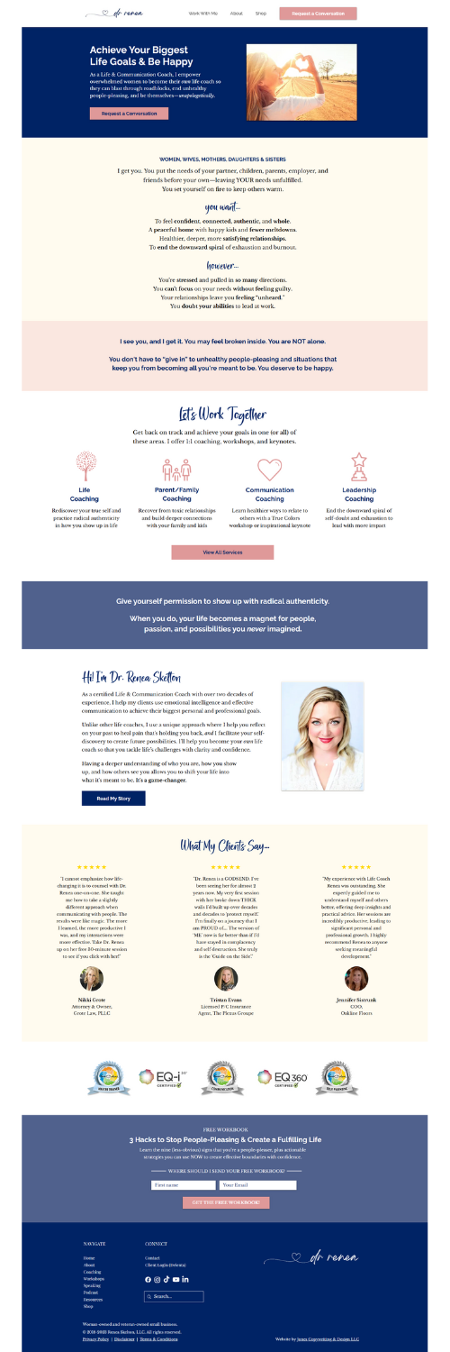
Renea Skelton, LLC: Redesign & Rewrite of a 9-Page Website with Online Store
Who: Dr. Renea Skelton, Life & Communication Coach
What: Redesign, rewrite, and search-optimize the existing website of Dr. Renea Skelton, a certified Life and Communication Coach based in Aledo, Texas.
Renea wanted a revamp of her entire website so that it supports her dynamic and growing brand, speaks to her ideal clients, and sets her apart from other life coaches. She also wanted to consolidate her online presence by making her website her “online hub” and removing her Linktr.ee page altogether.
When: 4 weeks from start to finish
Where: www.ReneaSkelton.com
How: Website strategy, redesign, copywriting, and SEO. Plus, streamlining of Renea’s Linktr.ee page design and content.
Before…
The Result
Built in Renea’s existing Wix account, her new website is now the “hub” of her business, where she can market to her ideal clients, engage her large fanbase of existing clients and customers, and magnetize her tens of thousands of social media followers.
After…
Project Details
First up, branding. After a 2-hour Website Strategy call to kick off her project, I created a mood board using Renea’s existing brand colors, adding fonts, images, and icons that captured the brand “personality” she desired: calm, inviting, and relatable.
Second, website strategy. After researching her industries, competitors, and ideal clients, I developed a strategy to organize the content “flow” of Renea’s website to maximize conversions (sales).
Renea is a life coach, trainer, speaker, and author, and she offers different services and products targeted to multiple, distinct audiences. Her website needed to be hyper-organized so that her ideal clients can find exactly what they’re looking for and be persuaded to reach out, download her lead magnet, or purchase a coaching package directly from her website.
Next up, the writing. Taking everything I learned during our Website Strategy Call and my own research, I spent the next week writing the copy (words) for all nine pages of the website. I also “wove in” Renea’s existing copy (she’s a great writer!) where I could, making sure to capture her tone and personality in the new copy I wrote.
Then, the design. Copy drives the design of a website, not the other way around. So, now that I had the copy wireframes all laid out, I built out each page design in Wix, then sent an easy-to-use preview link to Renea to review the website and provide feedback.
Finally, the launch! After some “behind-the-scenes” stuff, including formatting the website for mobile devices, SEO, third-party app integration, and testing everything, we launched the new website!
Need a total revamp of your existing business website?
“I stand in awe and respect for Amber’s expertise in creating my website. She took my vision and literally turned it into reality.”
— Dr. Renea Skelton, Certified Life & Communication Coach
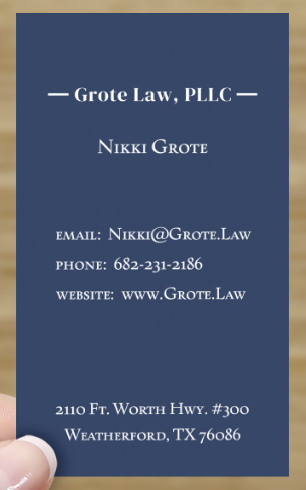
Grote Law, PLLC: Single-Page Website, Branding, Invoice & Business Cards
Who: Nikki Grote, Attorney & Owner of Grote Law, PLLC
What: Design, write, and publish a new, single-page website for Nikki Grote of Grote Law, PLLC, a law firm based in Weatherford.
Nikki wanted to establish her online presence, attract prospects via search engines, and persuade her ideal clients to request an initial consultation—and make it very easy for them to do so.
When: 3 weeks from start to finish
Where: www.Grote.Law
How: Website strategy, design, copywriting, branding, and SEO. Plus, business card design and invoice template design.
The Result
Built on Squarespace, Grote Law’s new website is now the “hub” of Nikki’s business. Since launching her website in May of 2023, Nikki has been able to easily book consultations and eliminate back-and-forth emails with prospects, allowing her to focus on legal strategy and delivering above-and-beyond customer service to her clients.
Project Details
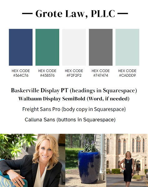
First, I created a “mood board” of colors and fonts that represented Nikki’s brand. After researching her industry, competitors, and ideal clients—and reviewing information she provided in a Brand Questionnaire I give to all of my clients—I wrote the first draft of the website copy (about 1,500 words). Then I built the single-page website in Squarespace, designed the page, and optimized the website for more visibility in search engines.
A single-page website is great for new service-based businesses that need to establish an online presence and make it easy for clients to reach out or schedule a consultation or appointment. Additional web pages can be added in the future as your business grows.


